Corporate brochures are powerful marketing tools that showcase a company's brand, products, and services. When designed effectively, they can leave a lasting impression on potential clients and partners. Creating a captivating corporate brochure requires a deep understanding of design principles, brand identity, and effective communication strategies.
Visual hierarchy in corporate brochure design
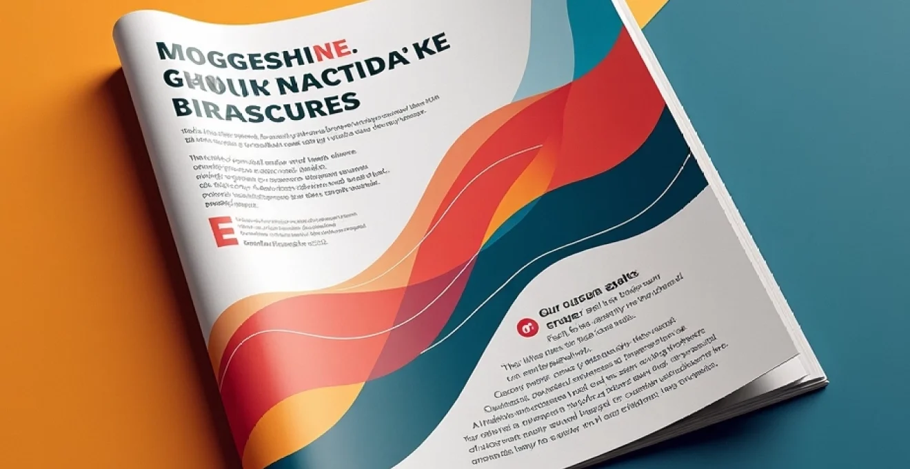
Visual hierarchy is the foundation of effective brochure design. It guides the reader's eye through the content, emphasizing key information and creating a logical flow. To establish a strong visual hierarchy, consider the following elements:
- Size and scale of elements
- Contrast between text and background
- Use of whitespace
- Placement of images and graphics
By carefully arranging these elements, you can create a brochure that not only looks visually appealing but also communicates your message effectively. Remember that the goal is to guide the reader's attention to the most important information first, then lead them through the rest of the content in a logical sequence.
Typography selection for brand identity reinforcement
Typography plays a crucial role in reinforcing brand identity and enhancing readability in corporate brochures. The right font choices can convey professionalism, creativity, or innovation, depending on your brand's personality. Let's explore some key considerations for typography selection:
Serif vs. Sans-Serif fonts in corporate communications
The choice between serif and sans-serif fonts can significantly impact the tone of your brochure. Serif fonts, with their small decorative lines at the ends of characters, often convey a sense of tradition and reliability. They're commonly used in industries like finance and law. Sans-serif fonts, on the other hand, have a clean, modern look that's well-suited for technology and design-oriented businesses.
Font pairing techniques for multi-page brochures
Effective font pairing can create visual interest and improve readability in multi-page brochures. A common approach is to use a serif font for headings and a sans-serif font for body text, or vice versa. The key is to choose fonts that complement each other while maintaining contrast . Aim for no more than two or three font families in a single brochure to maintain consistency and avoid visual clutter.
Custom typography and its impact on brand recognition
Custom typography can set your brand apart and enhance recognition. Many successful companies use proprietary fonts that are instantly recognizable, such as Netflix's custom sans-serif typeface. While developing a custom font may not be feasible for every business, consider modifying existing typefaces to create a unique look that aligns with your brand identity.
Legibility considerations for print and digital brochures
Legibility is paramount in both print and digital brochures. For print, consider factors like font size, line spacing, and contrast against the background. Digital brochures require additional considerations, such as screen resolution and device compatibility. Always test your typography choices across different mediums to ensure optimal readability.
Color psychology in corporate brochure design
Color is a powerful tool in brochure design, influencing emotions and perceptions. Understanding color psychology can help you create brochures that resonate with your target audience and reinforce your brand message. Here are some key aspects to consider:
CMYK vs. RGB: color models for print and digital brochures
When designing brochures, it's crucial to understand the difference between CMYK (Cyan, Magenta, Yellow, Key/Black) and RGB (Red, Green, Blue) color models. CMYK is used for print materials, while RGB is for digital displays. Always design print brochures in CMYK to ensure accurate color reproduction. For digital brochures, use RGB to take advantage of the wider color gamut available on screens.
Creating accessible color palettes for diverse audiences
Accessibility should be a priority when selecting colors for your brochure. Consider color blindness and ensure sufficient contrast between text and background colors. Tools like WebAIM's Contrast Checker can help you verify that your color choices meet accessibility standards. By creating accessible color palettes, you ensure that your brochure can be effectively read by a wider audience.
Color harmony techniques: monochromatic, complementary, and analogous schemes
Color harmony is essential for creating visually pleasing brochures. Three common color harmony techniques are:
- Monochromatic: Using variations of a single color
- Complementary: Using colors opposite each other on the color wheel
- Analogous: Using colors adjacent to each other on the color wheel
Each technique can create a different mood and visual impact. Experiment with these schemes to find the one that best aligns with your brand identity and the message you want to convey in your brochure.
Layout strategies for effective information flow
The layout of your corporate brochure is crucial for guiding readers through your content and ensuring they absorb key information. Effective layout strategies can significantly enhance the impact of your brochure. Let's explore some essential layout techniques:
Grid systems: from swiss grid to modular layouts
Grid systems provide a framework for organizing content in a visually pleasing and coherent manner. The Swiss Grid, developed in the 1950s, remains a popular choice for its clean, organized approach. Modular layouts, which divide the page into a series of modules, offer flexibility while maintaining structure. When choosing a grid system, consider the complexity of your content and the overall aesthetic you want to achieve.
White space utilization in corporate brochure design
White space, also known as negative space, is a powerful design element that can enhance readability and focus attention on key elements. Don't be afraid to leave ample white space in your brochure design. It can create a sense of elegance and sophistication while preventing the layout from feeling cluttered or overwhelming. Strategic use of white space can guide the reader's eye to important information and create a more enjoyable reading experience.
Z-pattern and F-Pattern reading behavior considerations
Understanding how readers typically scan content can help you design more effective layouts. The Z-pattern is common for pages with minimal text, where the eye moves in a Z shape across the page. The F-pattern is more common for text-heavy pages, where readers scan horizontally across the top, then move down the left side, scanning horizontally again. Design your layout to work with these natural reading patterns to ensure your key messages are placed where readers are most likely to notice them.
Responsive design principles for digital brochures
For digital brochures, responsive design is crucial to ensure a good user experience across various devices. Implement flexible layouts that adapt to different screen sizes, and consider how your content will reflow on smaller screens. Use scalable vector graphics (SVGs) for logos and icons to maintain quality at any size. Remember to test your digital brochure on multiple devices to ensure it looks and functions as intended across all platforms.
Imagery and graphic elements in corporate storytelling
Visual elements play a crucial role in corporate storytelling, helping to convey complex ideas quickly and memorably. High-quality images, infographics, and illustrations can significantly enhance the impact of your brochure. When selecting imagery, ensure it aligns with your brand identity and supports your message. Custom photography or illustrations can set your brochure apart and create a unique visual identity.
Effective use of imagery can increase engagement and information retention by up to 65% compared to text-only content.
Consider using data visualization techniques to present complex information in an easily digestible format. Charts, graphs, and infographics can help readers quickly grasp key points and statistics. Remember to maintain a consistent visual style throughout your brochure to create a cohesive and professional look.
Print production techniques for High-Impact brochures
The final step in creating a captivating corporate brochure is the print production process. The right printing techniques can elevate your design and create a tactile experience that leaves a lasting impression. Let's explore some key considerations in print production:
Paper stock selection: coated vs. uncoated finishes
The choice of paper stock can significantly impact the look and feel of your brochure. Coated papers provide a smooth, glossy finish that enhances color vibrancy and image sharpness. They're ideal for brochures with lots of photographs or colorful graphics. Uncoated papers offer a more natural, tactile feel and are often chosen for their eco-friendly appeal. They work well for text-heavy brochures or when you want to convey a more organic, artisanal brand image.
Special printing effects: embossing, foil stamping, and spot UV
Special printing effects can add a premium touch to your brochure and make it stand out. Embossing creates a raised texture on the paper, adding depth and interest. Foil stamping applies a thin layer of metallic foil to create shiny, eye-catching elements. Spot UV is a glossy coating applied to specific areas, creating contrast with matte sections. These techniques can be used to highlight logos, important text, or create interesting textures.
Binding methods: perfect binding vs. saddle stitching
The binding method you choose affects both the functionality and appearance of your brochure. Perfect binding, where pages are glued to a spine, creates a professional, book-like feel suitable for longer brochures. Saddle stitching, where pages are stapled at the fold, is more economical and works well for shorter brochures. Consider the length of your brochure and its intended use when selecting a binding method.
Sustainability considerations in brochure production
In today's environmentally conscious world, sustainability in print production is increasingly important. Consider using recycled papers or those certified by organizations like the Forest Stewardship Council (FSC). Vegetable-based inks are a more eco-friendly alternative to petroleum-based inks. Additionally, consider the size and quantity of your print run to minimize waste. Communicating your commitment to sustainability in your brochure can also resonate positively with environmentally conscious audiences.